How to Design a Message that Moves
/When your print piece moves organically, you see it clipped behind a magnet, repurposed as a bookmark, or tacked to a bulletin board; you know it captured someone's attention with a message that meant something. We recently designed a card with the dual purpose of sharing a positive message and with a mission toward movement. Based on the fun calls and texts we received, we're sharing a few key details that went into the card design to inspire your next piece.
The Big Picture. The first consideration for any custom piece is understanding the ultimate goal. How do you want people to feel when they see it, open it? Is there an overarching message you want to communicate? In our case, we wanted to share the word “Joy” intentionally. It was a specific choice, one we felt was better suited to us than the words, Cheer or Celebrate, as an example.
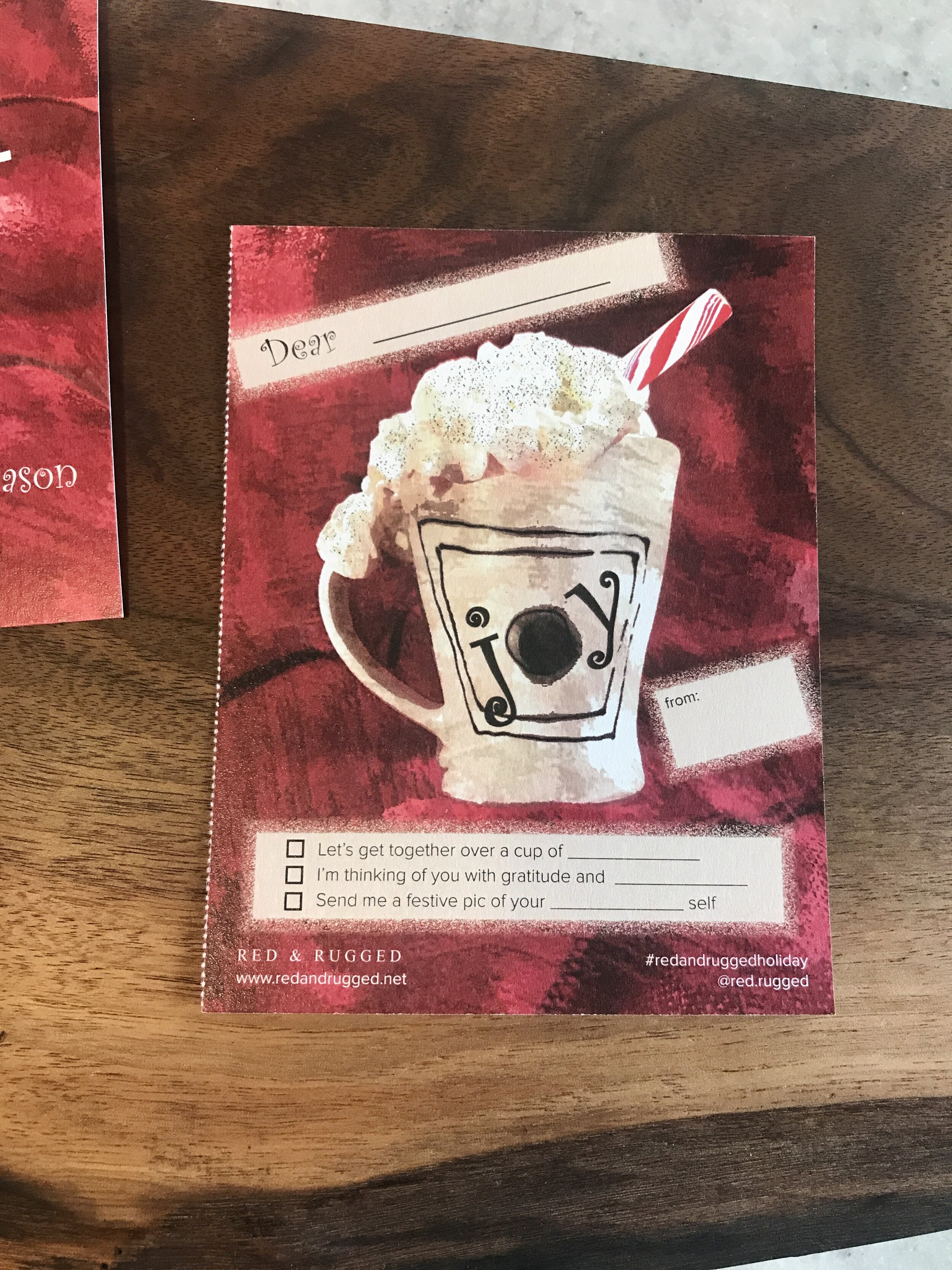
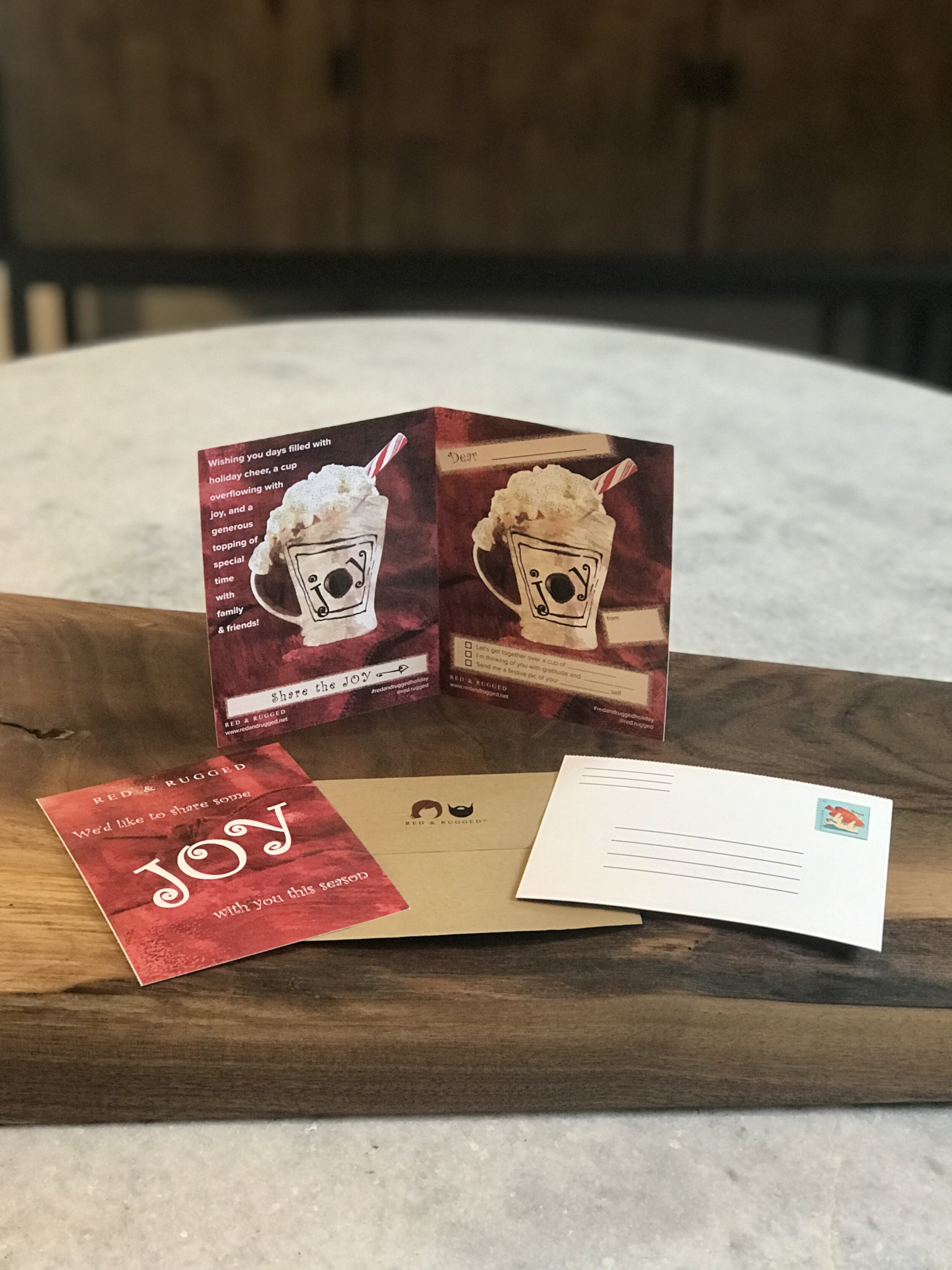
Pass It On - Having the card move and be shared between people was a central theme. In social we see it happen with reposts, tagging, and shares, but we forget this can occur with a physical piece too. Creating a voluntary hand-off, a reason to share, was the most challenging part; encouraging movement without making it too complicated. Our choice was a perforated card that included a postcard mailer, something our recipients would tear off and want to mail to their person of choice. (Access to a talented print team comes in handy. We work with Schmitz Press.).
Engaging and Interactive – When people think of interactive, they often go right to a digital or online platform; however, you can accomplish this in print. How can you get people to interact and do something fun with your mailer? We created three different checkboxes with whimsical fill-in-the-blank lines for people to complete.
Pick your Postage - We affixed the postcard stamp as part of the mailing to encourage people to address and mail the tear-off postcard. It was an added expense, however, worth it when our recipients sent their postcards, which was the whole point. On a funny note, the Post Office only had fish postcard stamps; they told us no holiday postcard stamps were coming. Not exactly a traditional choice, but we didn't get hung up on it. The envelope stamps for the entire card were holiday-themed, and that was more important.
Creating unique elements that make an impact with clients is a priority in our business. Yes, we do all the online things; however, creative, non-digital communication is a welcome reinforcement and bonus to email and online outreach. Let's face it, this is a process that anyone can do, but few people will. That’s why it’s a smart move.


